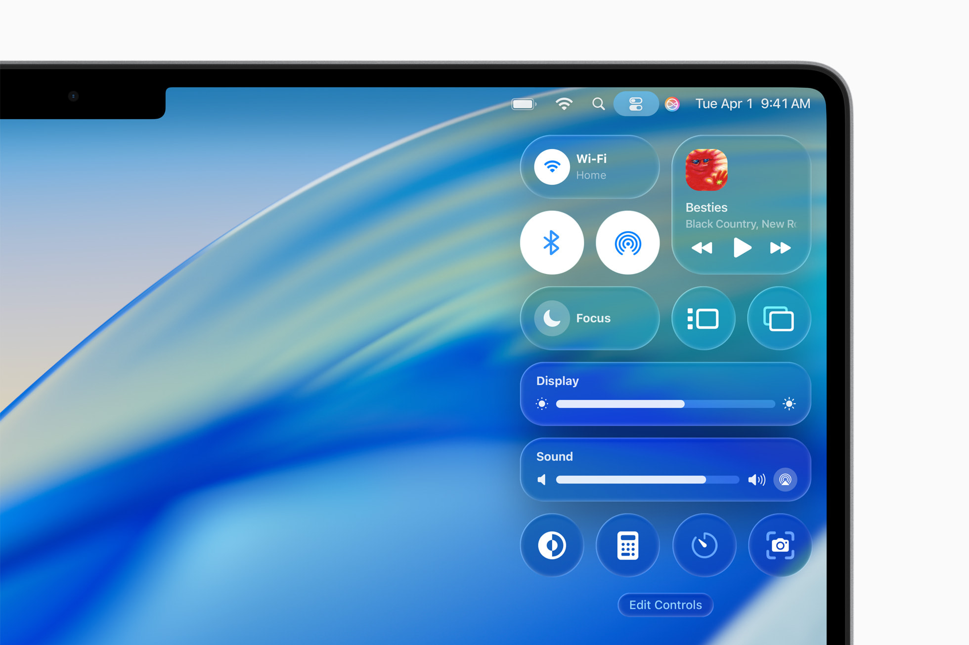
Liquid Glass: A Sideways Step for UX/UI
Apple's been dabbling with this "liquid glass" look in their latest operating systems, and honestly, as someone who geeks out over good UX/UI, it's got me scratching my head sometimes. It's like they're trying to make everything look like it's trapped in a slightly blurry jar of jelly. But hey, it's not all bad! Let's unpack why this trend feels like a bit of a mixed bag, with just as many delightful surprises as head-scratching moments.
�� What Exactly Is This Liquid Glass Thing?
Think of those translucent backgrounds/elements with a frosted glass effect that beautifully blur whatever's behind them. It's an effect that web designers have been leveraging for many years, and it’s meant to add a sense of depth and separation, making things feel lighter and less blocky. Liquid glass applies a similar effect, with some extra parameters for light refraction, depth, dispersion, and frost. If you have the deluded misfortune of owning an Apple product, congratulations, you'll get to experience liquid glass in all of its awkwardness. 😌

�� Okay, So What's the Good News?
Alright, alright, before I go full grumble-mode, let's give credit where credit's due. This liquid glass effect isn't just for show.
- A Dash of Modern Elegance: The aesthetic is undeniably sleek and modern. It gives the interface a premium, almost futuristic feel. When done right, it can make the UI feel incredibly light and airy, avoiding the heavy, clunky feel of older designs. It’s a visual refresh that certainly grabs attention and feels distinctly "Apple." 🍎

- Visual Hierarchy and Focus (Sometimes): When applied thoughtfully, this effect can actually help guide your eye. By blurring out the background, the foreground element – say, a notification or a pop-up window – becomes the immediate focal point. It creates a subtle separation that says, "Hey, look at me! I'm important right now." This can be particularly effective for modal dialogs or quick actions where you want to minimize distractions. 🙌

- Contextual Awareness (Theoretically): One of the cooler aspects, and perhaps a hint at Apple's long-term vision, is the way the blurred background subtly reveals what's underneath. It offers a fleeting glimpse of your wallpaper or the app you're in, maintaining a sense of place without being overly distracting. This could be a building block for more immersive mixed-reality interfaces down the line, where digital elements need to seamlessly blend with the real world. 🌍

�� And Now, for the Buts... My Inner Usability Nerd Twitches:
While it might look kinda sleek in a product demo, in everyday use? I'm not so sure it always hits the mark. 🤨
- Hello, Legibility Issues! 👋 This is my biggest beef. Blurring something out makes it harder to read -- can you believe that? Sure, sometimes the contrast is managed okay, but other times it feels like I'm squinting through a slightly greasy lens. When you're trying to quickly glance at a notification or find a menu item, that extra bit of visual noise from the blurred background can be surprisingly distracting. It’s like trying to read a menu through a smudged window – charming in theory, frustrating in practice. AND ANYONE WHO PAIRS WHITE TEXT WITH GLASSY WHITE ICONS ON A LIGHT BACKGROUND DESERVES THE FIRING SQUAD, JUST SAYING. 😤

- The "Depth" Deception (or Lack Thereof): The whole idea is to create a sense of layers, right? But honestly, most of the time, it just feels... blurry. It doesn't really scream "this is on top of that" as much as it whispers "everything is a little out of focus." True depth cues in UI often rely on more subtle shadows, clear boundaries, and well-defined layering, not just a generalized blur. Sometimes it feels less like elegant layering and more like a missed eye exam. 👁️
- Consistency? What's Consistency? The degree of blur and translucency seems to vary a bit across different parts of the OS, and sometimes even within the same app. Sometimes it’s subtle, other times it feels like someone smeared Vaseline on my screen. This lack of consistent application can actually make the interface feel less cohesive, not more. It’s like a visual Jekyll and Hyde, keeping your eyes guessing. 😵💫

So, Is It a Step Back or a Step Sideways?
Honestly, it feels like both. The "liquid glass" effect is a testament to Apple's commitment to pushing visual boundaries and creating a distinct aesthetic. When it works, it's genuinely beautiful and can enhance the user experience by providing a subtle sense of depth and focus. However, when it falters, it can compromise the fundamental principles of legibility and clarity, which are cornerstones of good UX. 👏
The true test will be how Apple refines this effect over time. Can they maintain the visual allure while addressing the practical concerns of readability and consistency? If they find that perfect balance, this "liquid glass" could indeed become a beloved and functional part of the Apple experience. But for now, it's a fascinating experiment with both dazzling highs and a few blurry lows. 🥱
What do you think about liquid glass? Do you love it, hate it, or are you somewhere in between? 🤔

